

 Read Client Stories





 Alex Kugell

 Key Takeaways
- Touch targets have defined minimums. Apple specifies 44×44 points, Google specifies 48×48 density-independent pixels, and WCAG 2.2 sets 24×24 CSS pixels as an absolute floor.
- Contrast is specified by WCAG AA, which requires 4.5:1 for body text and 3:1 for large text and interactive components.
- Thumb reach shapes layout, with primary actions belonging in the lower half of the screen, since that is where a thumb comfortably reaches on a phone held one-handed.
- Tab bars outperform hamburger menus for discovery in most consumer apps, though the menu still has its uses.
- Respect the platform. iOS and Android users have different expectations about back navigation, sheets, and typography, and ignoring that makes an app feel subtly wrong.
- Financial apps carry an extra burden, because a mistake costs money rather than a moment of confusion.
Designing user-friendly mobile apps goes well beyond simple techniques like using large touch targets, ensuring high contrast, and keeping load times fast.
You need to let users complete the task they came there to do without even thinking about the interface at all.
Let’s look at some essential tips to help you get there, with specifications alongside the principles, plus the parts that change when your app handles something people care about losing.
At Trio, our developers have extensive experience working on complex financial apps that need to work well, or you end up losing the user trust that your product likely hinges on.
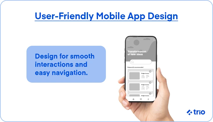
What makes a mobile app user-friendly?
As we have already mentioned, a user-friendly app lets someone finish what they came to do without thinking about the interface.
That sounds obvious, but it can actually be quite demanding, because mobile adds constraints desktop never had.
You need to optimize for one hand, a small screen, variable light, unreliable connections, and an attention span directly competing with simple, short-form content and other social media.
The entire foundation of designing user-friendly apps lies in how people physically hold their devices.
Where a desktop interface assumes a mouse pointer with pixel accuracy, a phone assumes a thumb with roughly a centimeter of imprecision, usually attached to someone walking.
Three principles carry most of the weight.
Consistency means the same gesture does the same thing everywhere in your app, so users build a working model rather than relearning each screen.
Clarity means an element’s purpose is apparent without explanation.
Simplicity means fewer steps between intent and completion, which matters more than any visual decision you make.
Research comes before all of it. Understanding who uses the app, what they are trying to do, and under what conditions shapes everything downstream.
What are the actual design specifications?
Here are the numbers the principles translate into.
Touch targets
Apple’s Human Interface Guidelines specify a minimum of 44×44 points. Google’s Material Design specifies 48×48 density-independent pixels.
WCAG 2.2 added a success criterion setting 24×24 CSS pixels as an absolute minimum with spacing exceptions.
We always recommend that you build to the platform guidance rather than the accessibility floor, since the floor is a legal minimum rather than a usability target.
Also keep in mind that spacing between targets matters as much as their size.
Two correctly sized buttons placed directly against each other still produce mistaps.
Contrast
WCAG AA requires a contrast ratio of at least 4.5:1 between text and background for normal text, and 3:1 for large text, which means 18pt or 14pt bold and above.
Interactive components and meaningful graphics also need 3:1 against their surroundings, while AAA raises body text to 7:1.
It’s always worth testing in sunlight rather than at your desk. A palette that reads comfortably on a bright monitor can disappear outdoors on a phone at half brightness.
Typography
Both platforms support user-controlled text sizing, Dynamic Type on iOS and font scale on Android.
Layouts need to accommodate someone who has set text to double size, which means avoiding fixed-height containers around text and testing at the largest setting.
This is one of the most commonly skipped checks and one of the most noticeable failures for older users.
Thumb reach
On a phone held one-handed, a thumb comfortably covers the lower and middle portions of the screen.
This means that the top corners, particularly the opposite-side corner, require a grip change.
Primary actions belong in the reachable zone, which is why bottom navigation and bottom sheets have largely replaced top-anchored patterns.
Performance
Launch time and response to input shape the perception of quality more than any visual choice.
Anything over even just a few hundred milliseconds without feedback reads as broken.
Where an operation takes longer, showing progress changes the experience considerably, even when total time stays the same.
How should mobile app navigation work?
Navigation determines whether people find features at all, and the main decision starts with whether it’s visible or hidden.
Tab bars keep primary destinations visible at almost all times, which supports discovery and lets people move between sections without backtracking.
We have found that these work well up to about five destinations, after which labels compress, and the pattern starts to fail.
Hamburger menus are the other option. They hide navigation behind an icon, which can reduce discovery and engagement compared with visible alternatives, since people do not explore menus they cannot see.
However, we’ve found that the pattern still earns a place for secondary items, settings, and apps with genuinely deep structure where no flat arrangement would work.
The mistake would be using it for primary navigation because it looks cleaner.
Gesture-based navigation has also grown in recent years as phones removed physical buttons.
Vertical swiping through content, as TikTok and Instagram Reels use, maps to natural thumb movement and feels more fluid than tapping through hierarchy.
Discoverability is the biggest trade-off here, since a gesture nobody knows about does nothing. Pairing a gesture with a visible control is a great option that covers both.
Platform conventions deserve respect even when they differ.
Android users expect the system back gesture to work consistently and expect it to exit the app from the root screen. iOS users expect an edge swipe to go back within a navigation stack.
Apps that override these behaviors can feel subtly wrong in ways users rarely articulate but consistently notice.
How do you design for different screen sizes and devices?
Mobile devices span a wide range of screen sizes, aspect ratios, and pixel densities, and a layout built for one specific phone will break on others.
Native platforms handle this through their own mechanisms.
iOS uses Auto Layout with size classes and safe area insets. Android uses constraint-based layouts with density-independent pixels and resource qualifiers for different configurations.
React Native and Flutter use Flexbox-style layout that adapts similarly.
Safe areas (empty room) need specific attention. For example, notches, dynamic islands, rounded corners, and gesture indicators all claim screen space, and content placed without accounting for them gets clipped or sits underneath a system element.
Both platforms expose the insets, so actually using them is the way to fix this.
We have also found that it’s essential to test on actual devices, so you are able to catch what simulators miss.
This catches issues like when a design looks balanced on a large phone but feels cramped on a small one. Tablet layouts usually need genuine rework rather than a stretched phone layout.
What features make a good mobile app?
Outside of just the layout, a few capabilities consistently separate apps people keep from apps people delete.
Offline functionality matters more than most teams plan for. Connectivity drops in lifts, on trains, and in buildings, and an app showing an error screen in those moments teaches people not to rely on it. Caching recent data and queueing actions for later sync covers most of this.
Low-friction registration affects conversion directly. Every additional field loses people. Social and platform sign-in options reduce the barrier, and deferring account creation until it is genuinely needed works better still.
Search becomes necessary once content exceeds what navigation can expose. Where it exists, it should be prominent rather than buried, and forgiving of typos.
Visible feedback on every action closes the loop. A button that changes state on press, a loading indicator, a confirmation after a save. Without it, people tap again, which at best duplicates an action and at worst creates a support ticket.
How do you test and improve mobile app design?
We have found that some design decisions that feel obvious internally frequently confuse people encountering the app for the first time, which is the entire argument for testing with real users.
Usability testing with even just a handful of participants will allow you to surface most major problems, and watching someone struggle with a flow you designed is more persuasive than any analytics dashboard.
A/B testing suits narrower questions once the fundamentals work, like exact button placement, wording, and the order of steps in a flow.
It answers which of two options performs better, not whether the underlying approach makes sense, so we have found that it works best after qualitative testing rather than instead of it.
Analytics fill in the last couple of things that testing cannot.
Good examples include drop-off points in a funnel, screens where people reverse out, and features nobody opens. These show where to look rather than why, so pairing them with qualitative sessions tends to be where the insight actually comes from.
Accessibility testing belongs in the same cycle.
You can run the app with VoiceOver or TalkBack, check contrast with a tool, and test at the largest text size to catch problems that affect a substantial share of users and might even carry legal exposure in several jurisdictions.
Designing mobile apps that handle money
Financial interfaces change a lot of the calculation, because the cost of a mistake shifts from mild confusion to real loss.
Irreversible actions need friction: Most mobile design advice pushes toward fewer taps, and that advice inverts when a tap moves money. Payment confirmation screens that restate the amount and recipient, require a deliberate second action, and clearly distinguish the destination from similar saved recipients all prevent errors that cannot be undone. Instant payment rails make this more important.
Trust signals carry design weight: People need to see that the connection is secure, that the institution is recognized, and that their data is protected, without the interface becoming cluttered with badges. Biometric authentication helps.
Numbers need care: Currency formatting, decimal alignment in lists of transactions, and clear distinction between credits and debits all matter more than they would elsewhere. Color alone doesn’t work since some users can’t distinguish green and red.
Regulation shapes the interface: Strong customer authentication requirements under PSD2 mandate specific authentication steps for certain transactions in Europe. Disclosure requirements dictate what has to appear before a user commits.
Error states deserve as much design attention as success states: A declined payment, an expired session mid-transfer, a network failure after submission but before confirmation. These are where financial apps lose trust.
Working with designers and developers
Good mobile design needs designers who understand platform constraints and developers who implement specifications rather than approximating them.
At Trio, we place engineers who have built mobile applications for financial products, where the accessibility and compliance requirements are explicit rather than optional, available through staff augmentation or as a dedicated team.
If you are planning a mobile build or improving one you already have, request a consult.